NEWS: The Food Pyramid Becomes A Food Plate
|
We loved the old food pyramid. But not everyone likes to read charts as much as we do, or count off the number of fruit, veggie and grain servings.
The original food pyramid, launched by the USDA in 1992, included the four food groups stacked in the shape of a pyramid with the number of recommended servings a person should eat from each group in a day. The widest part of the pyramid depicted the foods that should make up most of the diet (cereals and grains). The top of the pyramid, indicating the group that should be eaten in small amounts, was fats. In 2005, the USDA revised the pyramid, expanding the number of food groups to six and adding a person walking up steps on the side of the pyramid to emphasize the need for exercise. But it wasn’t popular with some nutritionists; and it for sure had no visible impact on the increase of child (and adult) obesity rates. |
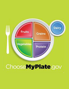
 So long pyramid, hello plate. Image courtesy MyPlate.com. |
|
|
The new guideline, MyPlate, is a dramatic departure: a simple visual so that people can eat healthy at every meal. The visual has four colored sections representing fruits, vegetables, grains and proteins. Next to the plate is a smaller circle representing dairy products. Now, instead a huge plate of pasta with a small salad or a large piece of meat and potatoes with a few broccoli florets, one can look at the plate and see that at least half of it should be grains and vegetables. (Pasta is a grain—but that grain shouldn’t occupy 100% of the plate.) On ChooseMyPlate.com, the USDA emphasizes several important nutrition messages: eat smaller portions, make at least half the plate fruits and vegetables and avoid sugary drinks. Here’s the advice from the USDA (none of it is news): Balance Your Calories
|
||

